


Tua is a brand image derived from Sih Zhi Tang to advance international chain stores. Original concept of the name “Tua” is to convey the complex of old school Taiwan, south France country and delicate goods from New York city.
Design content includes the development of visual identity and applications / website organization / name card / packaging for dessert.
Development of Main Visual Identity
Steamed fish for chief’s special dish and group of white fish in bathroom forming a floating visual feast. By the skill of natural hand drawing and simple black and white lines to signify the original spirit of Tua.


Application—Website user interface design
For the reason of easy for Sih Zhi Tang updating information, we use the existing platform to construct Chinese and English version for their website, by the image galleries and visually issued which are simple and easy to understand to meet the need of building a connection between restaurant and customers straightly.


Development of Secondary Visual Identity
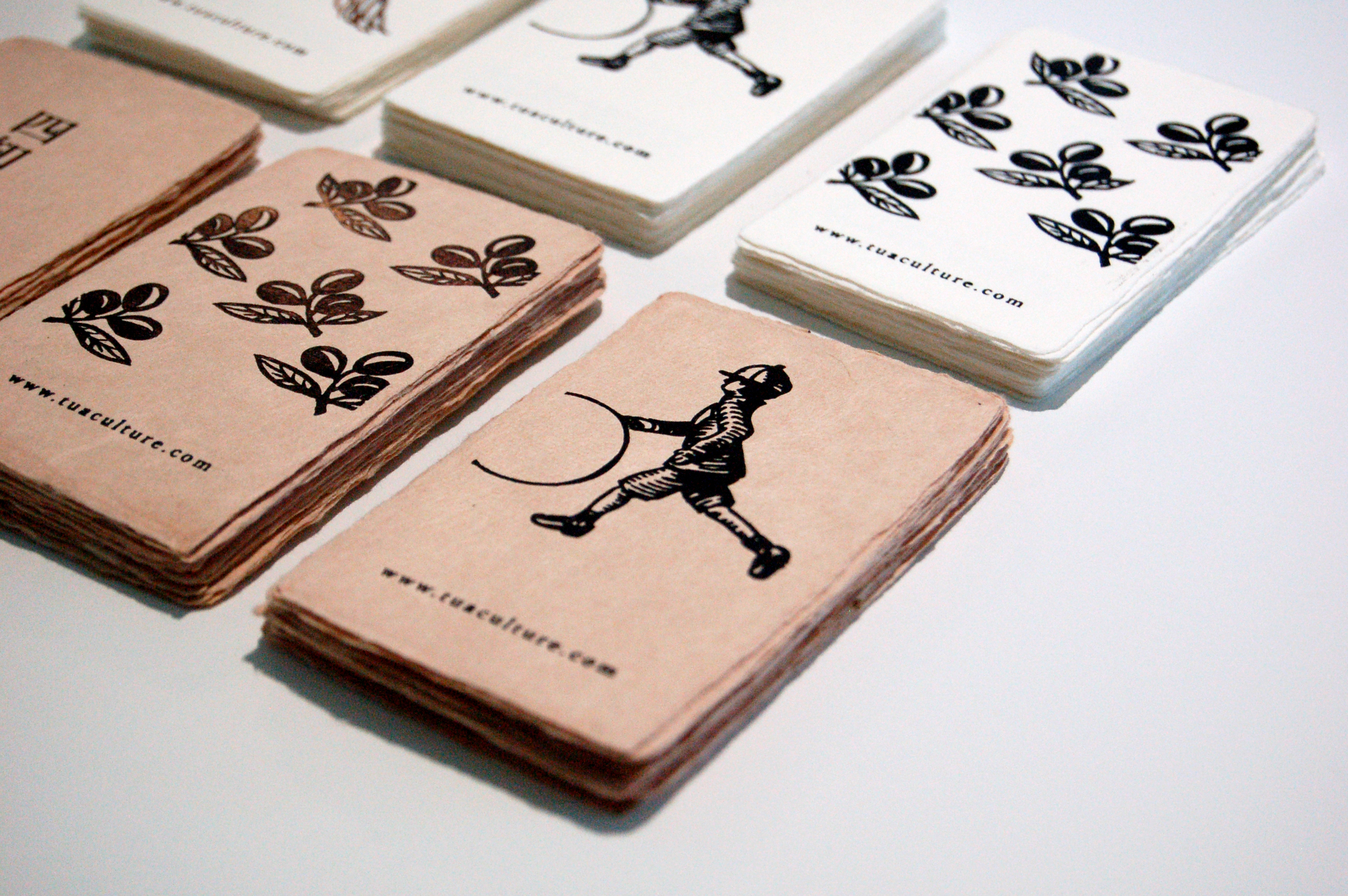
3 different beloved things which are asked by client have developed into patterns, and apply on the related products.


Name card design


Packaging for dessert


Year
2014
Client
Sih Zhi Tang
Team
Ai & Jane
See other design service


